This Is the Best Photo Taking Advice I Can Give You
I thought I’d share one of my iOS photo workflows. It’s always in the flux; changes often, never stays quite the same. But there’s a general approach I take that makes sense. Most people don’t seem to know how to make good pictures, I thought I’d share some considerations when taking photos and how to make a good photo look great.
Taking a picture
Taking the picture is the process of getting what you want to capture from the real world into your device. Here are some general tips and things most people do wrong in the capturing moment.
- Make what you want to capture the center of the photo. Make it as big as possible. This means the space around what you want to capture is not as important as the thing you want to capture. It doesn’t make sense to have anything else on the picture, than the thing you want to capture. Except(!) when it makes sense to have more space left, or right, or above, or below artistically.
- While you are framing the picture, also make sure to make a straight picture. The object you want to take a picture of should align with the edges of your device. Some apps have a grid they can show.
- If your app can show a grid you can use it to make the center of your image slightly off-center. This generally creates a more interesting picture.
- Lighting is important. If the lighting is not optimal, that’s not a big drawback. Tap the object that you like to take a picture of on the screen. Your device will try to focus it. If the image gets too dark or too bright, try an object in the near vacinity. This will ensure the focus is still good on your main object, but the lightness will be adjusted to make the picture look better overall. If the lighting doesn’t seem to get better tap something else on the picture to make your device focus it. Take the picture when you feel happy with the lighting.
Takeaway: Take care of framing, leveling, and lighting your main object well.
Corrections
After the picture has been taken, you can work on optimizing it. Generally most apps have decent tools for optimization adjustments, but it is recommendable to follow a certain pattern. I’m not religious to follow the same steps every time, it is better to take care of the same things every time. These are, again: framing, leveling, lighting.
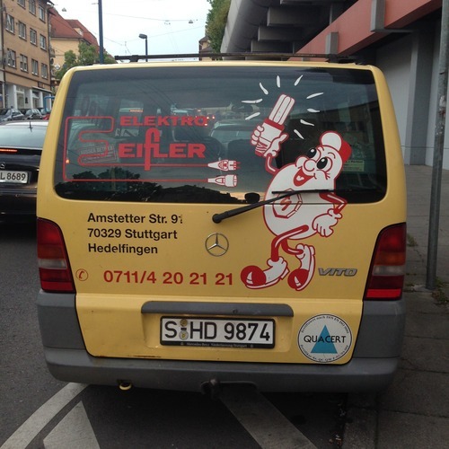
At the moment I like SKRWT for the first round of optimization. The app has some really neat tools to focus on the main object. In my example you can see that I made slight adjustments to the rotation, but I also reduced the space on the edges to focus more on the main object — the logo of this company. Play with the app and you can get a feel of its power and usefulness.
After this first optimization step I like to focus on colors and brightness. At the moment Perfectly Clear does a good job here. The app has a sole focus on “fixing” levels, brightness, contrast, and several other things. Some rules of thumb:
- Some people think that boosting the brightness of a picture makes the picture brighter, and better. The entire picture does become brighter with a brightness adjustment, but it is the entire picture, not just problematic areas. If your app supports it, you can usually do a much better brightness job by adjusting high, mid, and dark levels instead.
- Contrast: also a misunderstanding is the concept of “contrast” in a picture. Adding too much contrast makes the picture look like a comic. It is normally better to play within the 10% range max, before going crazy with it. Try to get a feel for very small contrast changes and how they affect your picture, then you can use a contrast slider much more effectively to achieve a certain look.
- If your app has a histogram, you can narrow the “used” colors to only those colors that are actually in the picture. A histogram will usually have a space on its top or low bottom, or both, where the picture has no colors. You can normally pretty safely narrow the color range to only those colors in the histogram. It is generally better though, to leave a little room on the top and bottom edge, so the picture doesn’t become too bright or dark. In the correction step for brightness and contrast, the histogram should come first, but as mentioned, your app needs to have a histogram in the first place, which most apps don’t have.
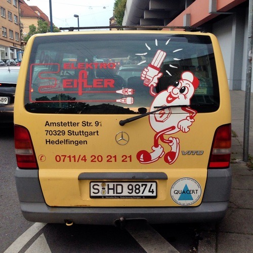
In my example you can see that after the second correction the image is much clearer.
For corrections I use: SKRWT, Perfectly Clear, Camera+, ProCamera, Photoshop Express, and Photogene (has a histogram), and Facetune.
Filters
Now that you have optimized your image, and if you don’t want to share it with other Hipsters on Instagram, you are done. Just leave the picture as it is now, but if you want to get some likes, add filters.
In my example I went with a heavily blue-ish filter that adds a lot of noise to the picture. I have several filter apps, but some just stay on my iPhone as the go-to standards. Camera+, ProCamera, PicsPlay Pro, VSCOcam, Photoshop Express (really good!), Stackables, Picfx.
In case you like to apply some more, less common, filters to a picture. Try something like PowerUp or Decim8.


Afterthought
My main goal with this piece was to give you an idea what “taking a good picture” actually means. What things to look for, what things a lot of folks do wrong, and how you can improve your own workflow and eyes.